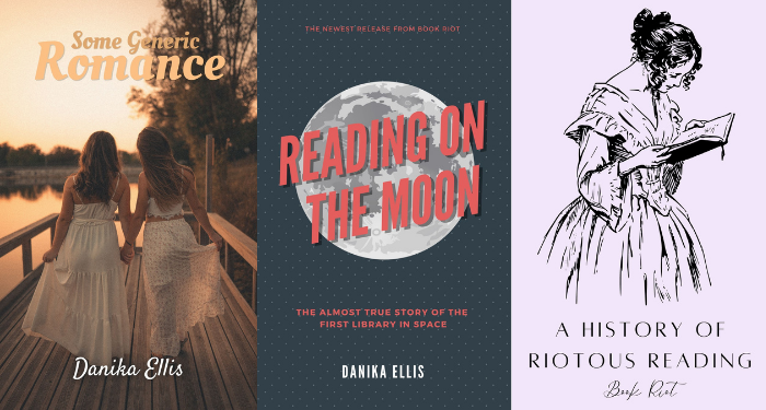
I have to preface this by saying I’m neither an author nor a graphic designer. Those both require skills I don’t have, and I admire the people who do. That being said, I am a reader, and I have opinions about book covers — as I think most readers do.
We’re living through a boom in self-publishing and small presses, allowing all sorts of stories to reach the market that wouldn’t have otherwise. It can be hard for these to reach their audiences, though, and covers are a major way they can catch a reader’s eye.
Obviously, small presses and self-publishing authors don’t have access to the same design budgets for a cover that major publishing houses do, and that’s completely understandable. A decade or two ago, that was a huge barrier. The skills required for book cover design were specific, and most people would find it difficult to do.
Times have changed, though, and graphic design is the most accessible it’s ever been. It still requires a lot of skill and practice to do well, but it’s must easier to hit the “acceptable” threshold now. There are plenty of free programs and websites that allow you to use templates to put together stock photos and fonts in a pleasing way. It won’t be the same as a thoughtful design by an artist, but it’s perfectly serviceable.
So why are there still so many bad book covers out there?
I’m not talking about the fact that some people like illustrated romance covers and some don’t. I’m not talking about boring book covers, or ones that could be polished a little more. I’m talking about BAD book covers. Covers with fonts that are hard to read and don’t match with the image. Stock photos that are over-used, irrelevant, or just plain awkward. The kind of covers that hurt to look at.
This isn’t just the domain of self-published authors, either. I’ve seen some small presses that have been around for decades that consistently put out awkwardly designed covers (just as I know plenty of self-published author whose covers could compete with mainstream publishers’).
I have never been an artistic or particularly visual person, but with the tools available for free online now, even I can put together a passable book cover. Not an amazing one! But one that won’t, at least, turn readers away from a book.

Canva is a graphic design platform that even offers templates for book covers. They have both free and premium options, but I stuck with the free options, including free graphics. Someone spending more time on these and with more of a talent for graphic design could certainly do better, but these took about five minutes each and were free.
With the premium option, you could do even better (and it would be easier, because you don’t have to sift through which options are paid and which aren’t). You could even design one during the premium free trial window if you wanted. For a little more money, you can hire someone else to design your book cover, and again, this is cheaper than ever. There are plenty of people on Fiverr with great examples of their work who will design a book cover for under $50 (with more options, including on Etsy, if you’re willing to spend more). Similarly, you can hire an artist to do the cover art and add the text in Canva.
With so many books to choose from, covers are incredibly important to get your book noticed. Especially on visual platforms like BookTok, Bookstagram, or BookTube, people may choose to include your book (or leave it out) based on how that cover looks on camera. It doesn’t matter how amazing your writing is if no one gets the chance to read it because the cover turned them away.
If you’re a self-published author or small press, I beg of you to invest in the bare minimum of graphic design for your cover. Get some people who are willing to give you harsh feedback and have them tell you what they think of it. See if it’s readable as a 1-inch tall thumbnail. Look through other covers of books in your genre and see what the visual shorthand is for your audience.
I don’t expect all writers to be excellent artists as well, but there’s no reason to stick your book with a bad cover when 15 minutes on a free platform can make it acceptable. Play around with the tools. Read a blog post on tips. Give your book a fighting chance in the visual landscape of the internet. Because readers definitely do judge books by their covers, and there’s no excuse to have a bad one anymore.
